


Nostromo.io may have started out as an in-house project, but it’s grown into an all-in-one project management tool for teams and professionals. It’s tailored to support each team member throughout the product development cycle, making their lives easier, projects run smoother and clients happier — all in a friendly, easy to use environment.
With its fun brand personality Nostromo.io and its mascot Nomo take a friendly and effortless approach to project management promising that it can all be done smoothly using the tool. The platform first hit the market with a free trial option, and users from 50+ countries signed up to put it through its paces. At the end of 2016, Nostromo introduced its subscription plans. A big moment in a product’s life.
In this case study, we explore the challenges we faced during the design phase, the learnings of our latest user research and the refinements we applied based on our research findings.
Challenges and design hypotheses
General challenges and the complexity of setting a software’s price are widely known — how do you make price plans appealing when they will always be the least appealing aspect of a product?
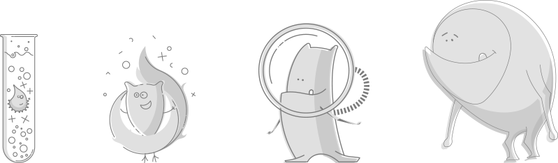
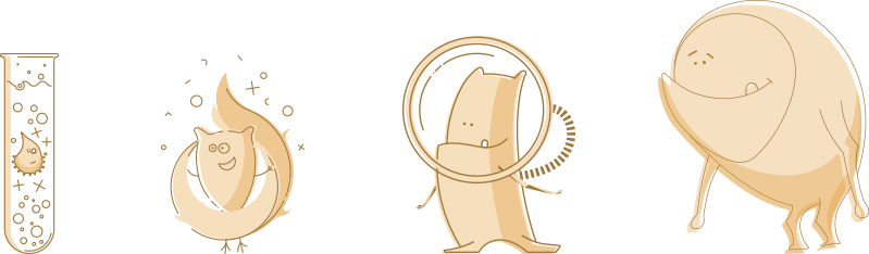
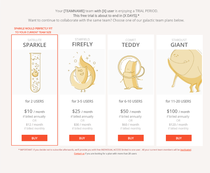
For us, this was a our real first design challenge — how can we sustain and further build the loveable Nostromo story and working environment with our price plans? Stepping out of our comfort zone, we opted for developing our little (and not that little) space creatures:
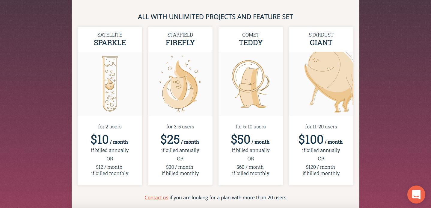
- Satellite Sparkle
- Starfield Firefly
- Comet Teddy
- Stardust Giant
These illustrations are aligned with the brand and can strengthen emotional bonds. On top of that, they make it crystal clear: size does matter. Especially team size, when it is about choosing the price plan most fitting for a Nostromo user.
On the pricing page, our creatures were paired with all the necessary facts and information which described the different plans on offer. We tried to avoid long text and repetition of information, instead applying a very simplified but — as we thought — an easy to understand copy structure. As all plans come with the same unlimited feature set, we positioned this information in a way which meant visitors cannot miss reading it.
Believing that feature set details will be important enough to be looked at, we thought — again — that users will happily scroll down and read our feature list carefully.
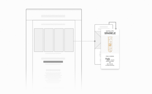
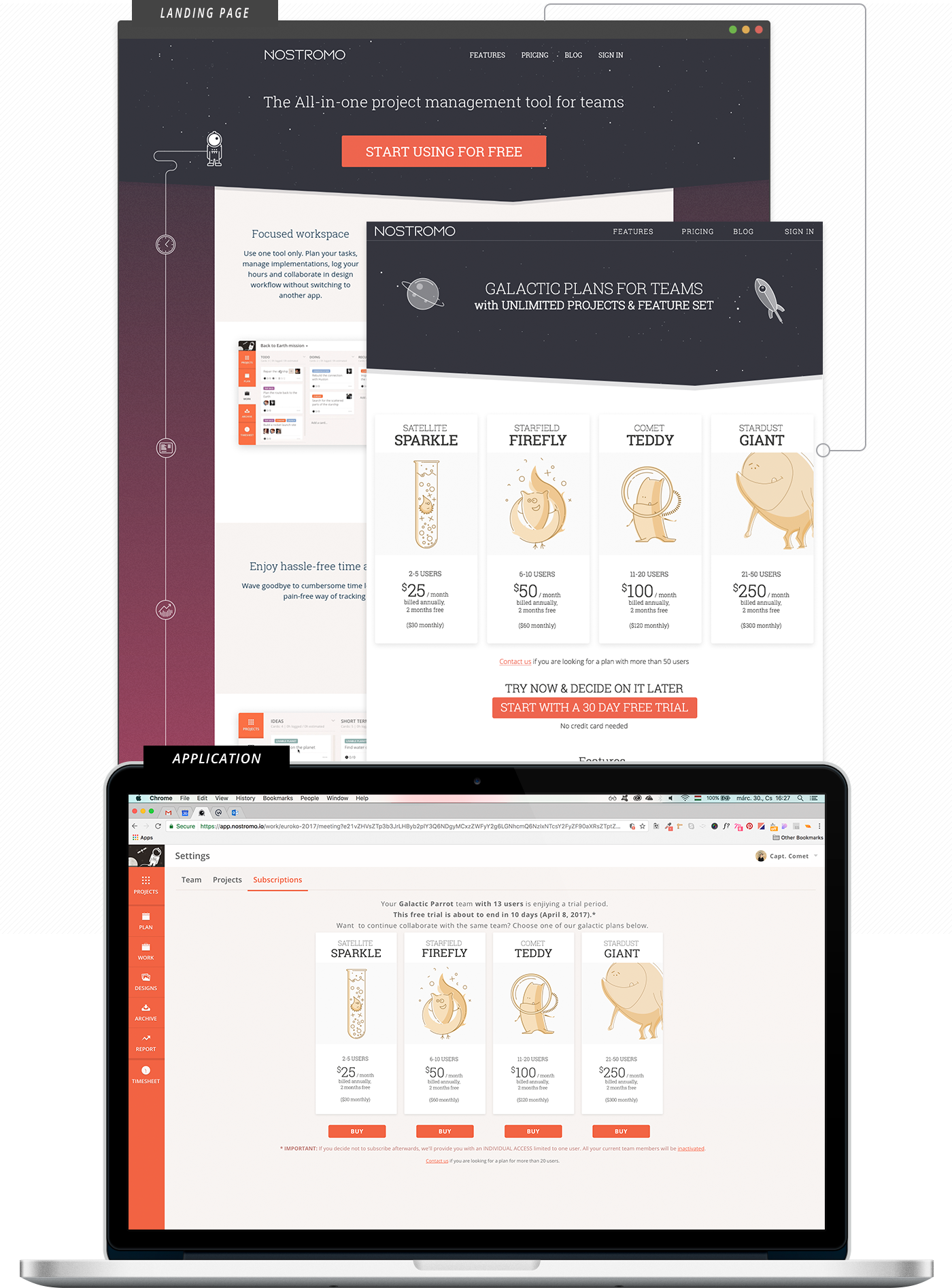
Since we offer a free trial as a start, it’s not possible to subscribe to a Nostromo plan straight from the landing page. A design challenge again: it only can be done in the application on a so-called subscription page. Will users find this page easily? Do we need to repeat all pricing information shown on our pricing page anyway? We decided to reuse the landing page content and added some extra elements for the sake of consistency and also to drive accurate decision making when it came to selecting the right plan. Of course, essential BUY buttons were also added.
Validation & Learnings
UX Research
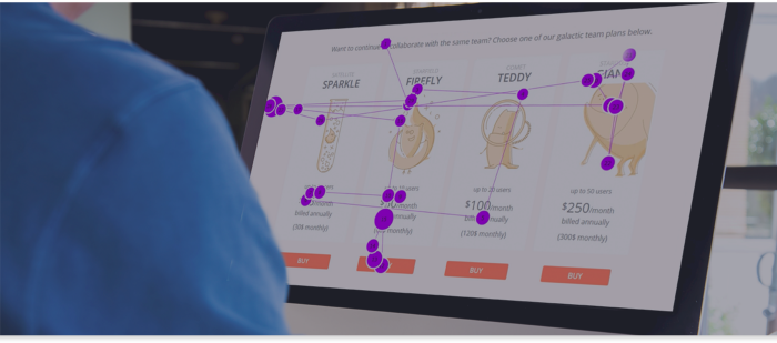
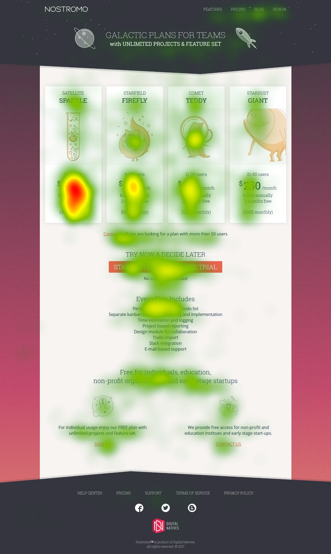
So our subscriptions went live and soon afterward we launched a UX research project to reveal any usability problems. This time we teamed up with the Ergonomy and Psychology department of Budapest University of Technology and Economics, to use their eye tracking system Tobii. Tobii eye-tracking which allowed us to “see through the eyes of our users”. We organized usability test sessions within the University test lab to test our new pricing page and the whole subscription process within the application.
Combining the data we gained from Tobii with outputs of a standard facilitated usability testing we gained valuable insight into the thought processes and browsing behaviour of our customers. However using eye-tracking alongside & analyzing gaze plot videos let us come to more precise conclusions.
Hypotheses proved to be true
- Our creatures are noticeable and loveable enough to be mentioned as intergalactically cute
- Building our pricing structure around team size is clearly understood and effectively backed by space creature illustrations
- Re-usage of pricing page design elements and in-app content on the subscription page let our users feel familiar with the options they had to choose from
Areas of potential concern
- A proper understanding of our offer: whilst on the pricing page, users missed reading the headline and subheadline and hence learned nothing about our unlimited feature set offer coming with all plans. This list of features almost went completely unread and those who started processing mostly lost interest whilst reading it.
- Deciphering the finances: The way in which we displayed our prices and payment frequency options (both on the pricing page and on the subscription page) proved made users feel confused and uncertain during the buying process
- Accessibility of our subscription page: Users were struggling to navigate to the subscription page
By conducting such extensive research, we were able to see the subscription flow objectively, through the customers’ eyes, shedding light on many of the concerns we had.
We were able to improve our subscription page and the workflow, which helped us create a friendly pricing plan and gain more paying customers.


Have a look at our social media